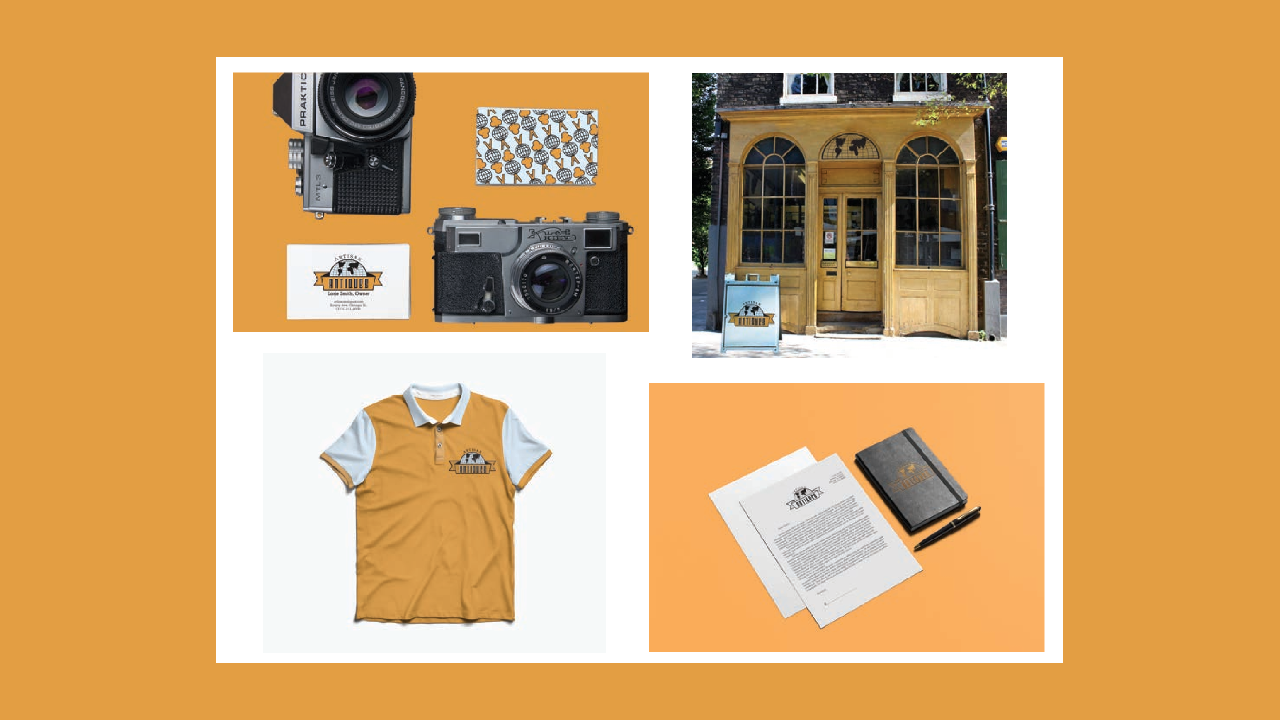
Artisan Antiques is an eclectic store located in Chicago's Old Town, situated in an original storefront echoing that of an old general goods store. Rare antique finds, collected locally and globally from the storeowner, include ephemera, paintings in gilded frames, glass, americana, primities, and furniture. Indoors, Artisan Antiques is organized chaos reminiscent of a 19th century apothecary. Similar colors (golds, blues, evergreens, browns, maroons) reside with one another for a cohesive and aesthetically pleasing look.
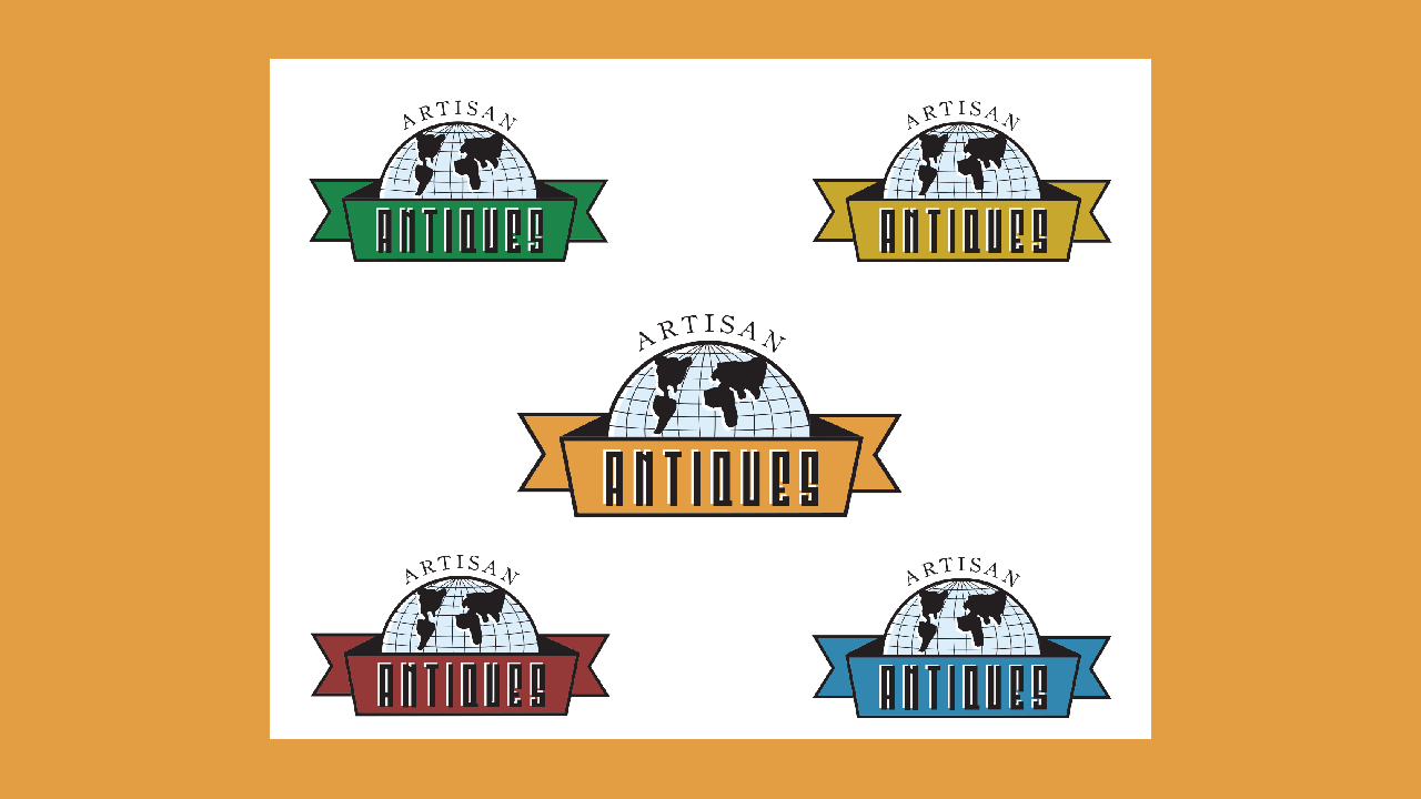
The logo pulls inspiration from different points of history to mimic the diversity of its products: vintage patches for travel and national parks, mid-century emblems, and the ancient illuminated manuscripts found in bibles and storybooks alike. All together, the ultimate underlying theme is discovery, which is achieved through the antique treasure hunt itself. Overall, Artisan Antiques establishes a brand presence most stores don't carry.
.png)
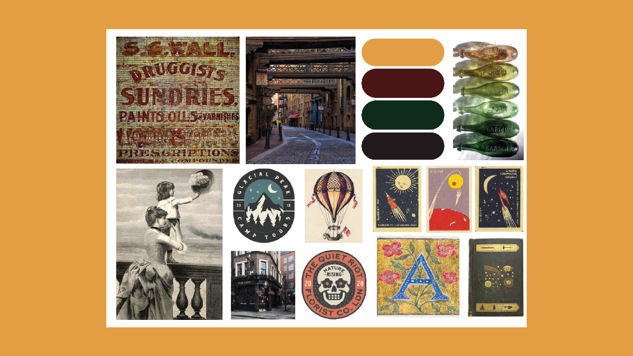
To further curate what Artisan Antiques represents, I created two mind maps for either work. Artisan mustered feelings of gold leaf gilding, blotty ink, faded print, and a hybrid between steampunk and Victorian symbols. Overall, Artisan is meant to be used as a descriptor, applied to its partner word to evoke the worn, antique essence. Antiques produced a hefty list which covered the feelings antiques create for many, like elegancy and intricacy. And yet, the items themselves as well: travel stickers, stamps, postcards, and inkwells. Around one hundred sketches were created until they were narrowed down to two pages. Three final logos were digitized and perfected upon until each achieved the desired effect. Retro and historical styles were embraced, emanating themes of wanderlust, discovery, and elegance.