
I was curious about “how” people “do” trips, what aspects they typically seek to have a comfortable or adventurous trip, and ways they noticed gaps in their trip planning process.I noticed there were certain features I could begin working with, including categories and options across needs: transportation, lodging, attractions, and more. I resisted these categories throughout the project.
.png)
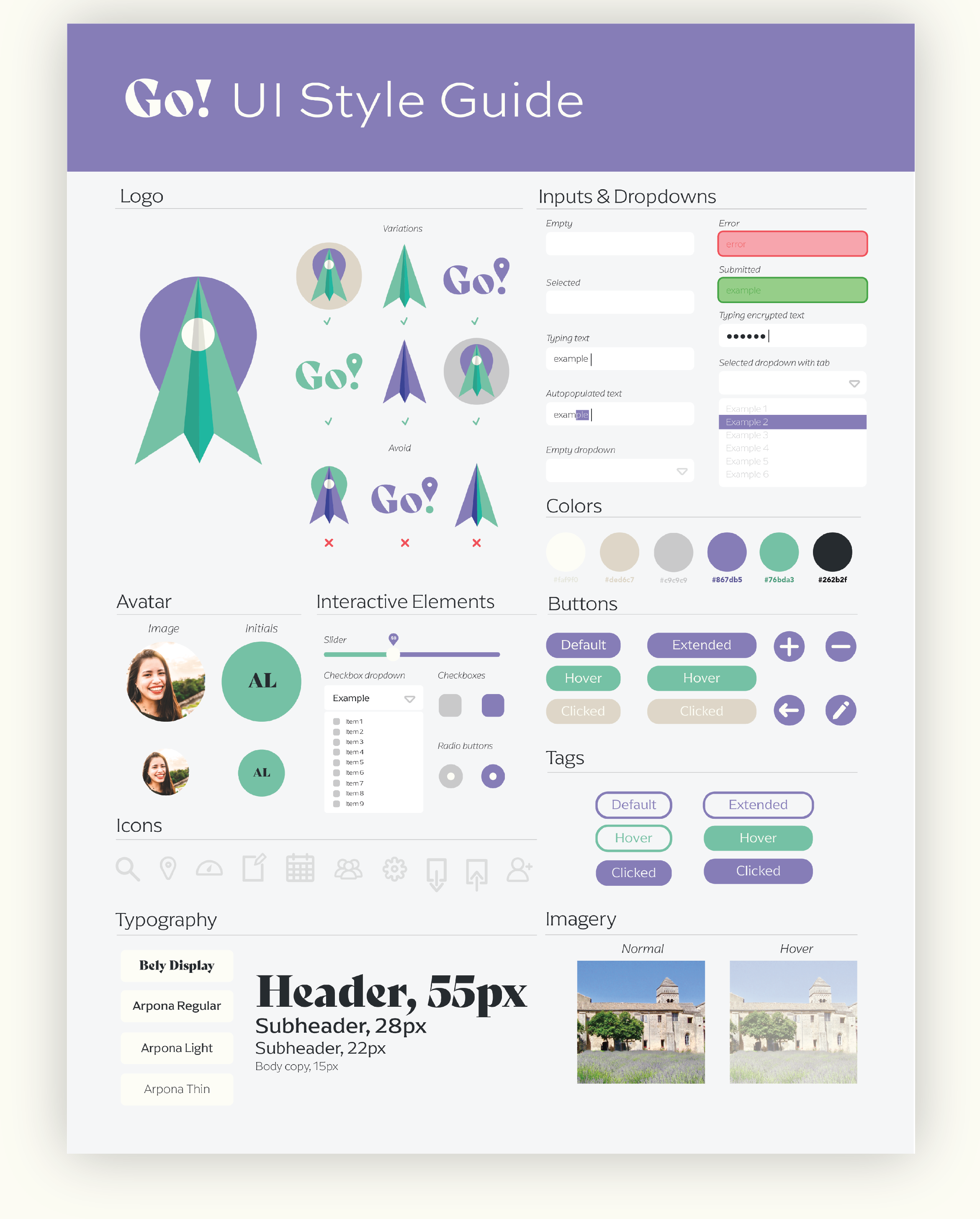
This was an iterative process that I revisited throughout the project. I solely crafted the brand feel: logos, icons, and all other elements.
.png)
After combining research with competitive analysis insights, I noticed three distinct users I could funnel into personas: a college student, a retired couple, and a secondary education program coordinator. While each are seeking the same goal in creating an itinerary, their goals would be met in different ways; this promoted fine-tuned consideration of what major and minor features would be necessary for Go!
My initial site map focused not only on the core user journey that was influenced from my personas, but pop-ups and various toggling states. It was at a state of granularity best suited for the prototyping stage, so I met with my mentors to create an abridged version. Being a web app, I strived for simplicity and minimalism, which is clear in the final version.
I determined that two major portions of my project would be (1) an opening questionnaire and (2) the rest of the screens. I created two comprehensive guides to follow.
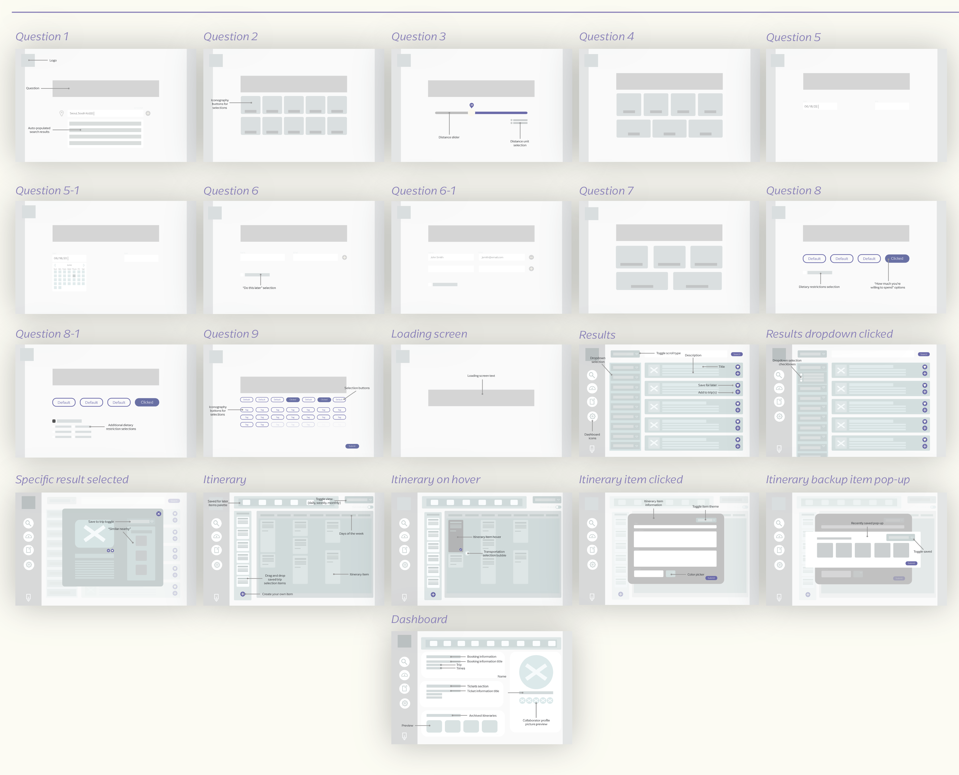
My lo-fi screens were inspired by my personas and initial research. I wanted to focus on unique features, including a guided questionnaire, a seamless results flow, a calendar-imitated itinerary, alongside customizations and conditions that the user could personalize.
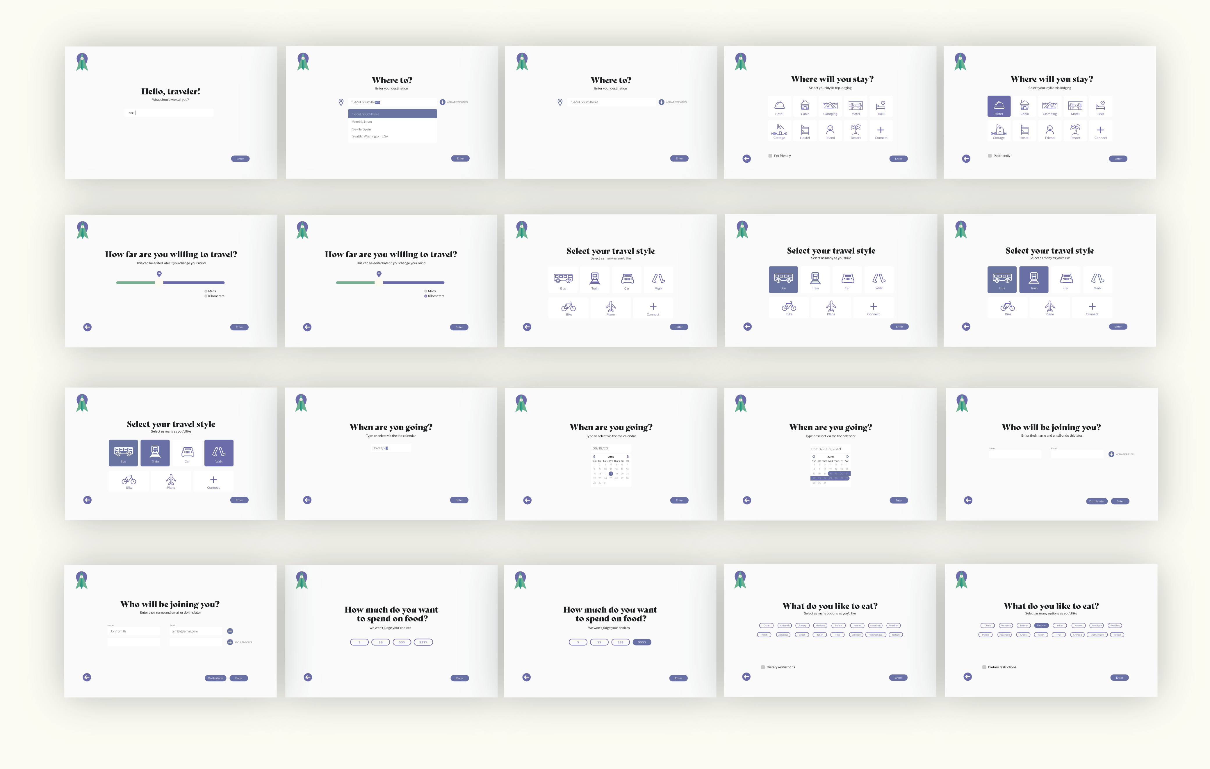
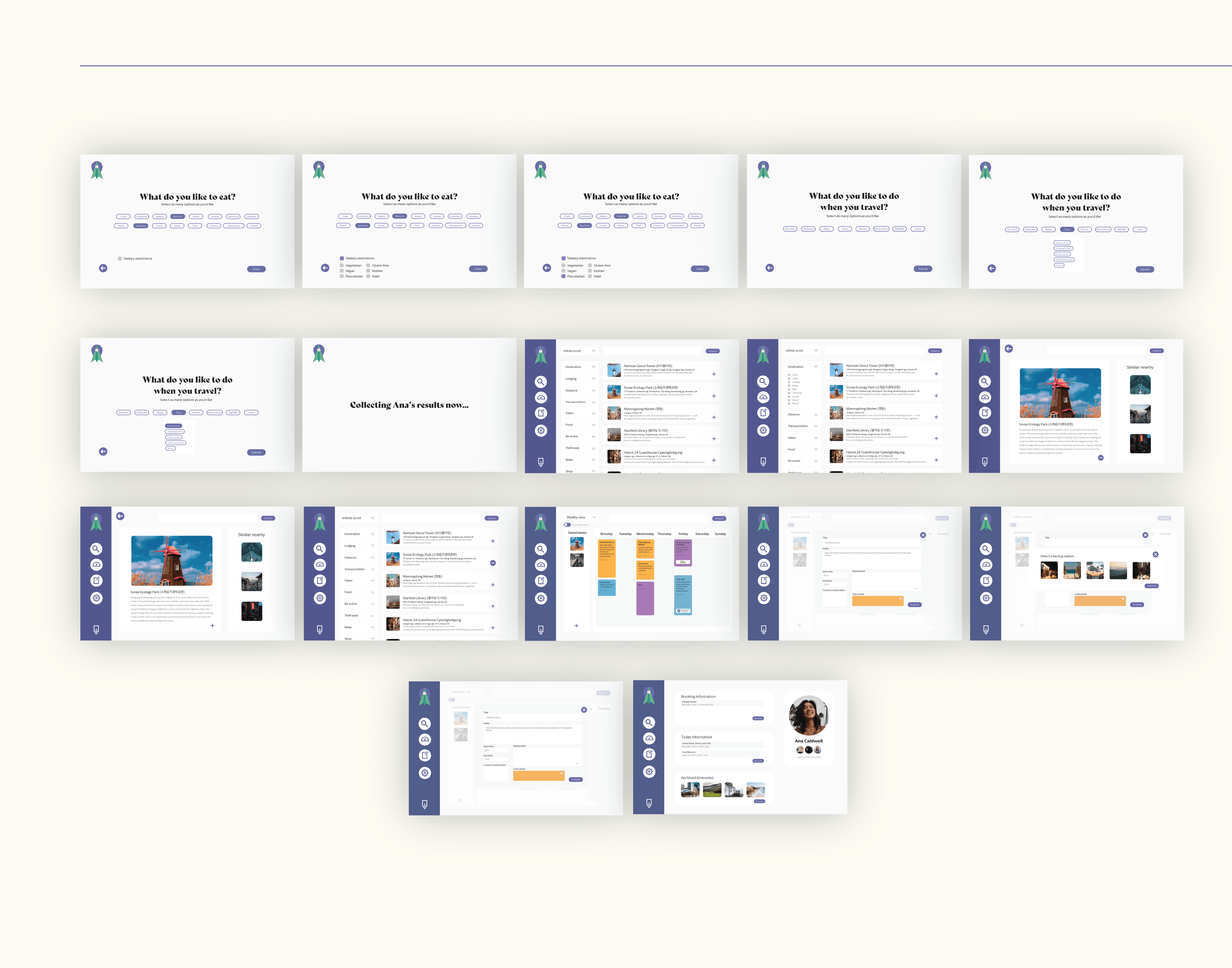
As I met with my mentors, I continued to develop my lo-fis until they were high fidelity – color, text, and all. Ultimately, the hi-fis were an iteration on the originals and began to take shape as my sense of each screen was established upon digitization.
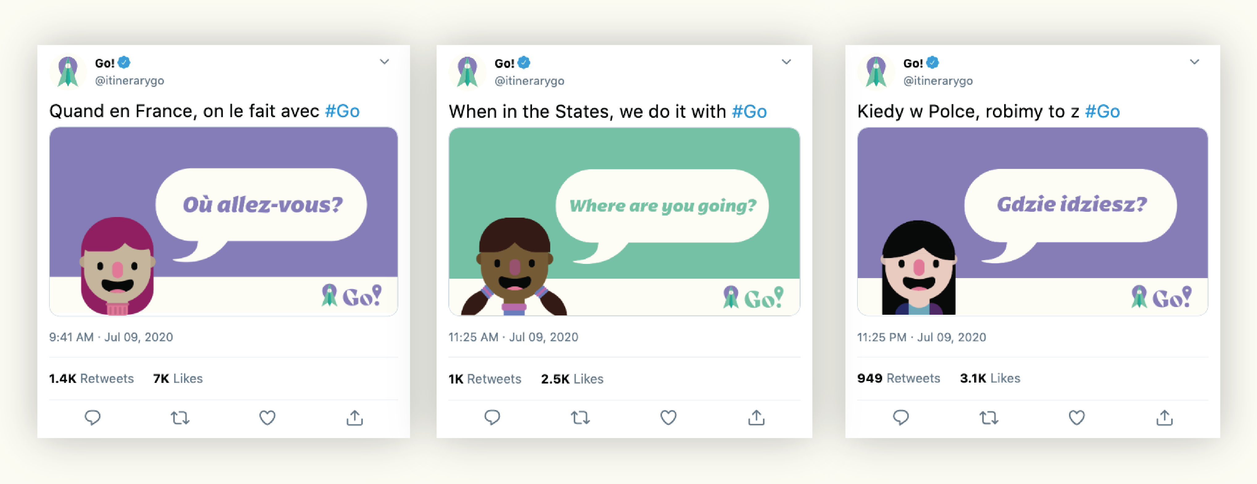
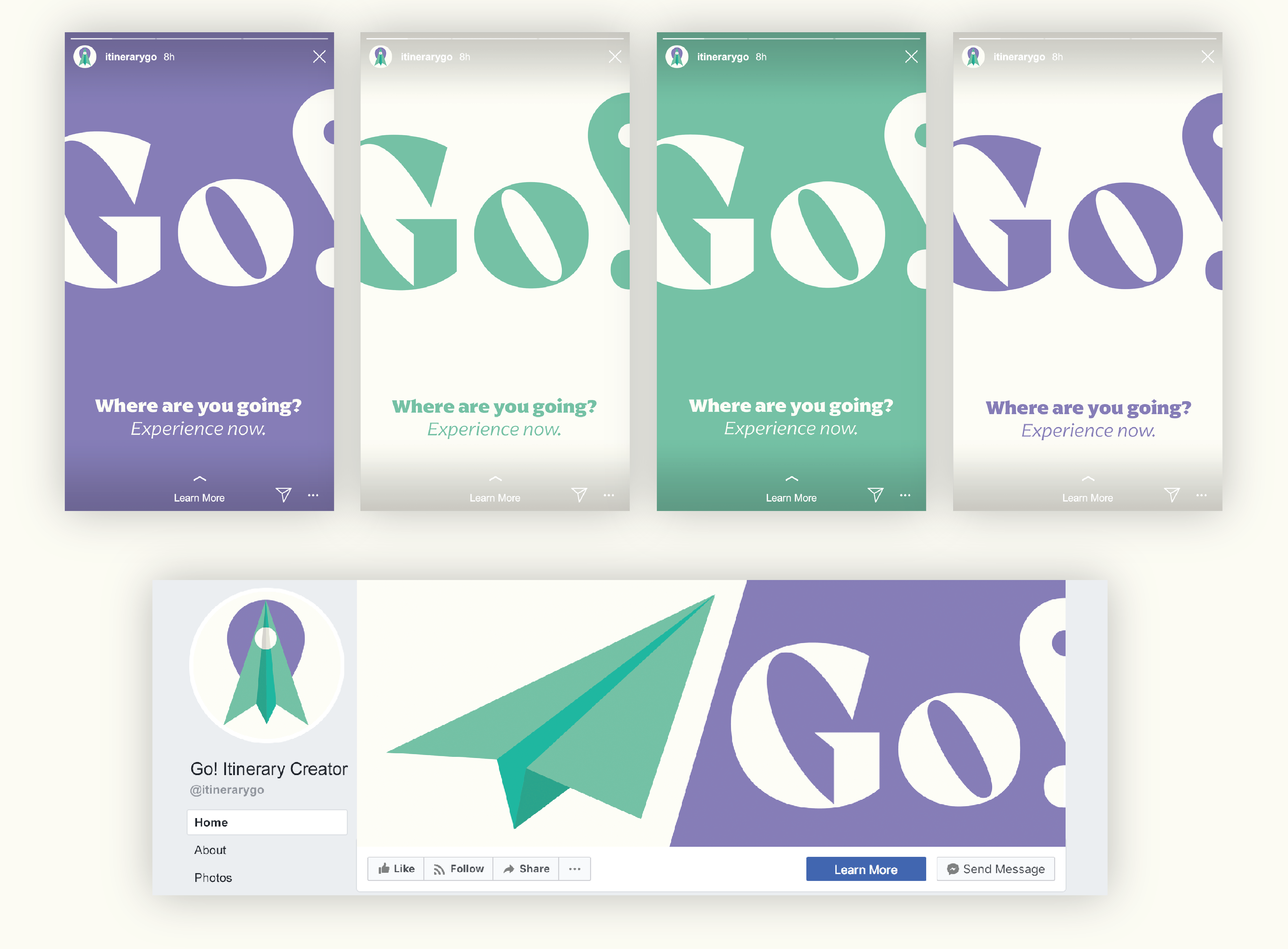
While making a variety of posts for different social channels, my favorite was for Twitter, where I created a multilingual campaign featuring different vector-based characters.
I would love to speak with a larger pool of people to expand on my research and continue to iterate on the screens throughout this process. Conducting guerilla user tests, card sorting, and other moderated think aloud sessions to explore how users are feeling – and grow the app with current and future needs.
