.png)
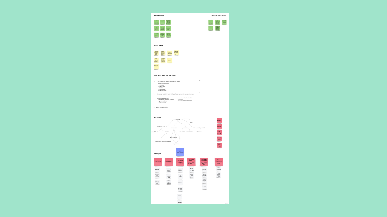
From the beginning, ideating via workshops and brainstorming sessions helped myself and my partner – as well as our team – to develop a mood board, a shared perspective of the problem, and questions to further explore.
With my partner, we allocated who would do what page. While we collaborated and brainstormed across every page as a team, my focus was with the services, contact/request, and case study focus pages.
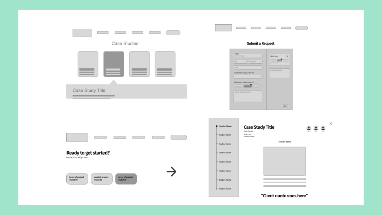
My lo-fi screens were a step I returned to throughout the earlier sprints as we received updated feedback from research and stakeholders.
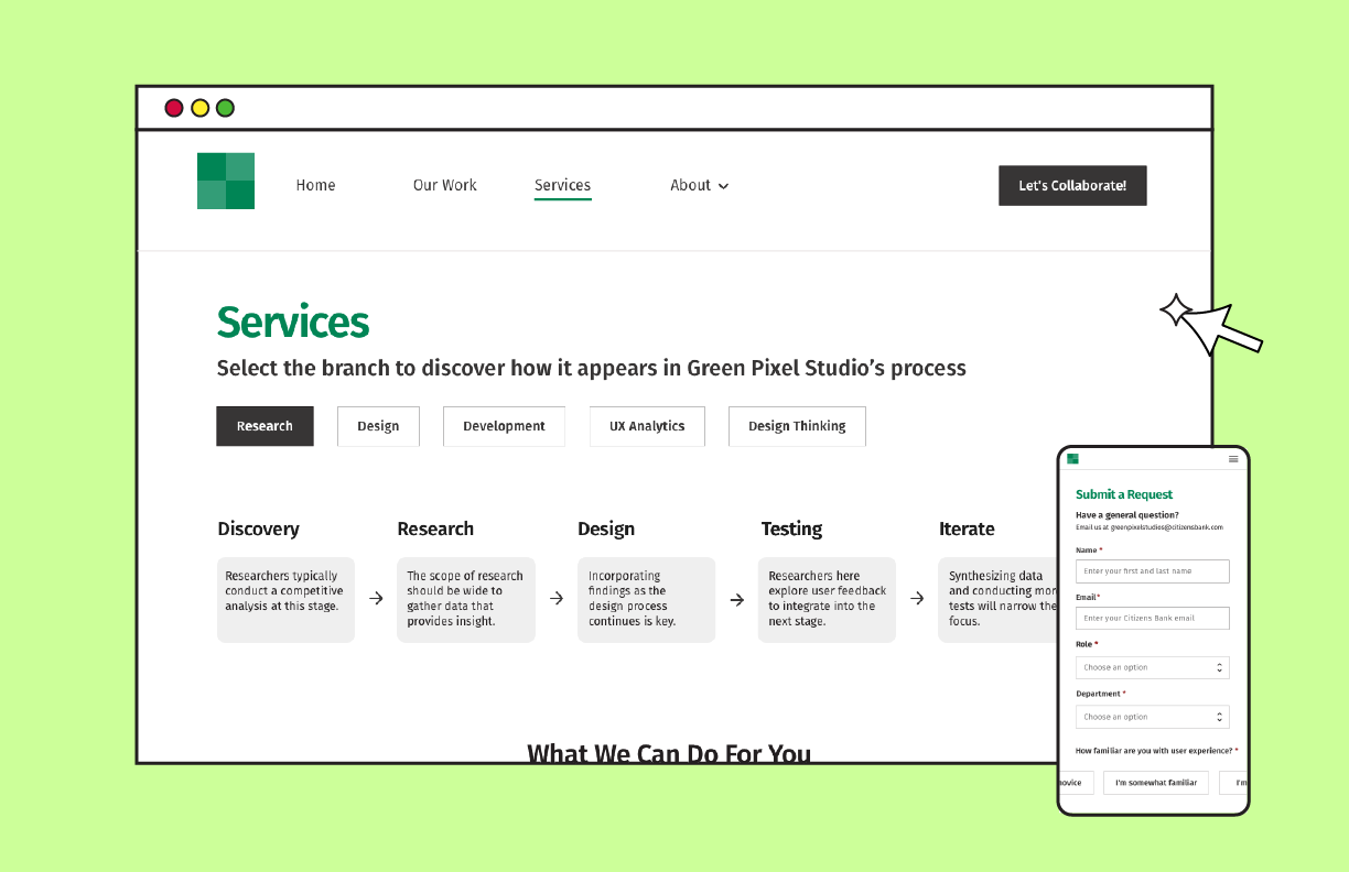
My hi-fi screens went through multiple iterations as we received updated research. An interesting issue I assessed was with the services page. I went through three versions throughout the scrum sprints. At first, I began with a tiled, hover-and-read interaction. After receiving research that noted users were confused about how to navigate and process the services, I added a multi-tab sub-navigation bar that allowed users to view each service by its respective department.
.png)
After a great conversation with my mentor, we discovered and identified that the real UX issue was not related to the specific services themselves, but how they were organized. Most prospective clients didn't have the mental models to understand each department and how a service related to that department or what overlapped in each step; therefore, I ultimately organized the services screen based off the UX process, what each department looked like during that step, and what services would be available during that step, finally unlocking the offerings from their original departments.
To better understand pain points associated with learning about GPS' work and initiating a project with the studio.
Interviews were conducted with 15 business leaders in Citizens departments, 13 of whom who have worked with GPS in the past.
Many users were not aware of the extent or value of GPS services.
Ultimately, this led to both researchers and designers understanding that the intake process needed represented with clear directions and inputs, a page needed to outline the process steps and cost, and prioritize different types of contact forms depending on the user's need (seeking more information vs. requesting a project).
Understand how potential users mentally organize information that will be presented on our website to inform the information architecture of our site map.
With UserZoom, we conducted an unmoderated open card sort study with 101 non-Citizens participants and 2 Citizens colleagues.
After collecting and analyzing research data with the other interns, myself and Julia met for a few hours to create our initial map, which we updated throughout the sprints to reflect updated data and insights.
Determine whether a static or dynamic, multi-step approach better aids users in requesting resources from GPS.
An unmoderated UserZoom study with 9 participants.
From the moment that I took on the contact page, I had two different ideas – either go with a form or go with a dynamic questionnaire that guided the user through the process. While the former was shorter, I felt that the latter would help those with an underdeveloped UX maturity to better understand GPS' process. The research interns conducted a few different studies to help determine the final option.
This presentation was halfway through the internship. While both myself and Julia had spoken with stakeholders in 1:1 or small group settings, this was the first check-in meeting with all seven in one Webex virtual conference room. This was our opportunity to showcase low and high fidelities, ask for insight, and opinions. With such a large group, we later analyzed findings and prioritized based off. off time and user needs.
Transforming our desktop designs into mobile screens, I viewed our website as a grid system. With any desktop, columns tend to outweigh rows in any particular section. Turning to mobile, the inverse occurs. Utilizing this mindset, I stacked our content and varied the heights and widths to match the typical phone screen.
My partner and I met with an accessibility specialist who works with the company. During this meeting, I applied the following to my designs to ensure standards were being met. These included consideration of screen readers, keyboard compatibility, and disabilities ranging from situational to chronic, as per Microsoft's standards.
• Are certain hover capabilities accessible with a keyboard?
• Alternative text for images should be concise and descriptive to decrease frustration
• Consider text contrast against the background
With more time, I would love to explore the client onboarding to investigate how the process either improved or changed because of the new user experience and flow through GPS' website.
