

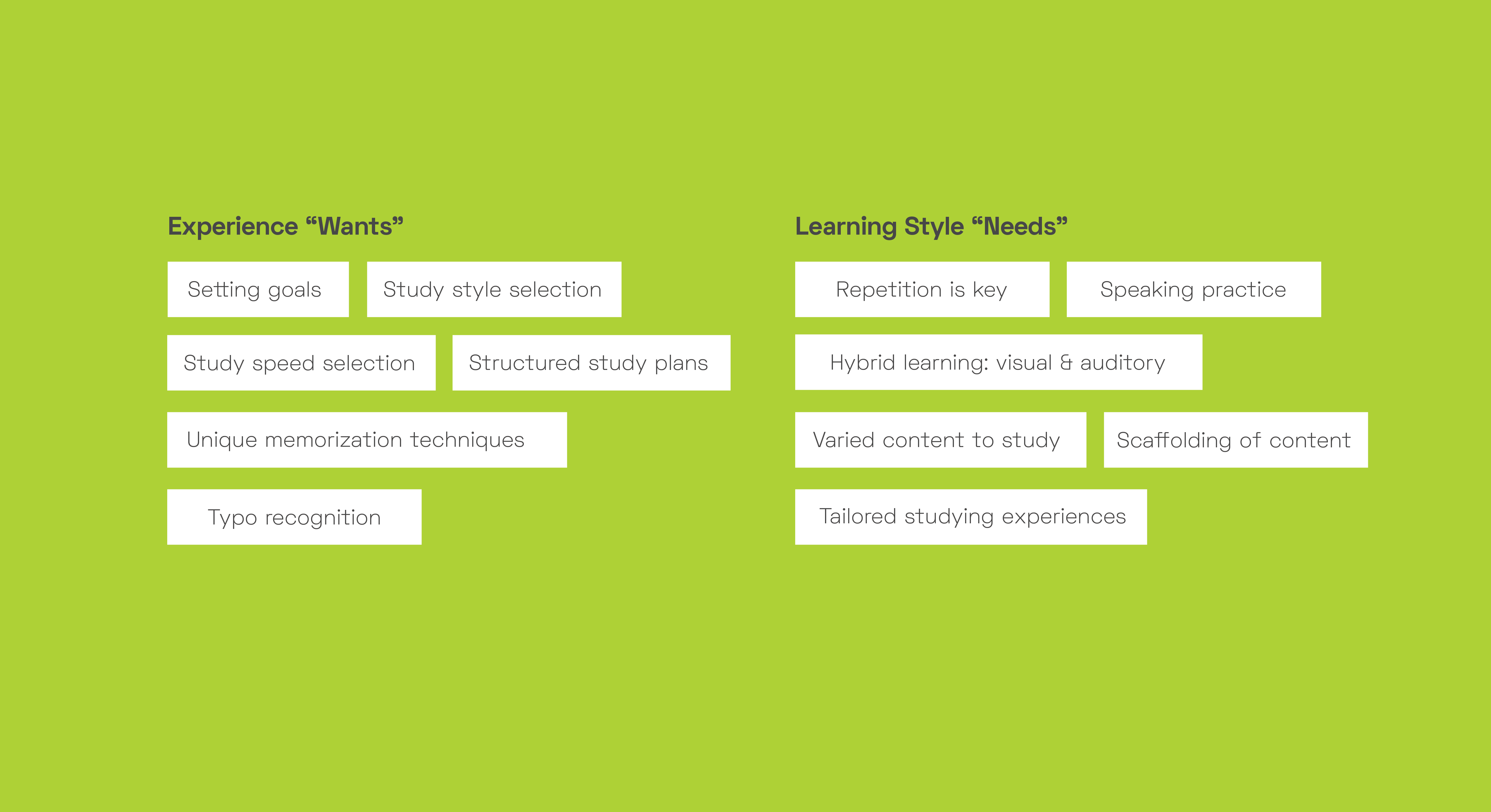
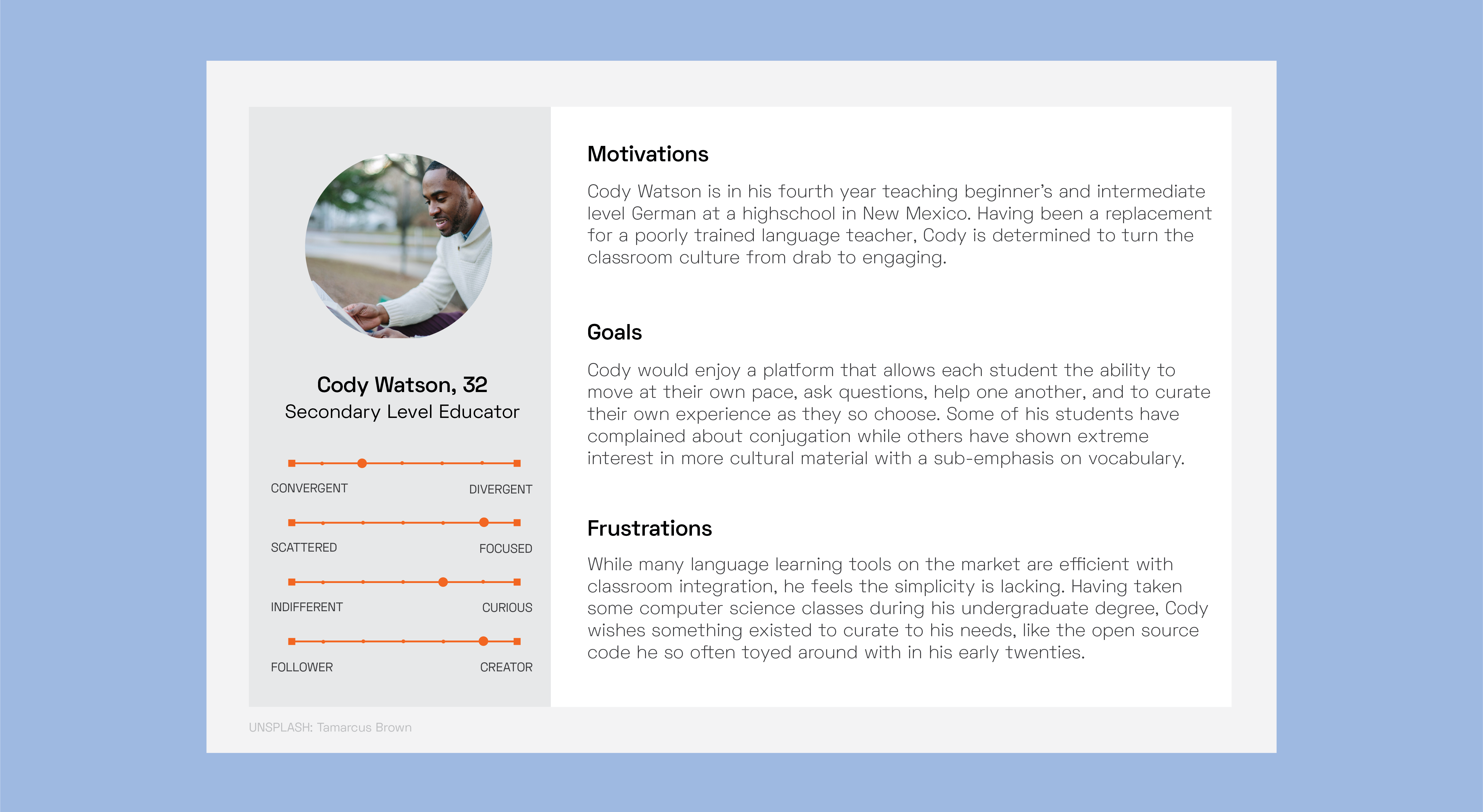
Among identifying current features and user experience pain points, I created a survey with fourteen questions, of which I received seven responses. Questions focused in on prior quiz making and study experiences with pre-existing platforms as well as language study, learning styles, and what processes have slowed down or improved learning a new language.
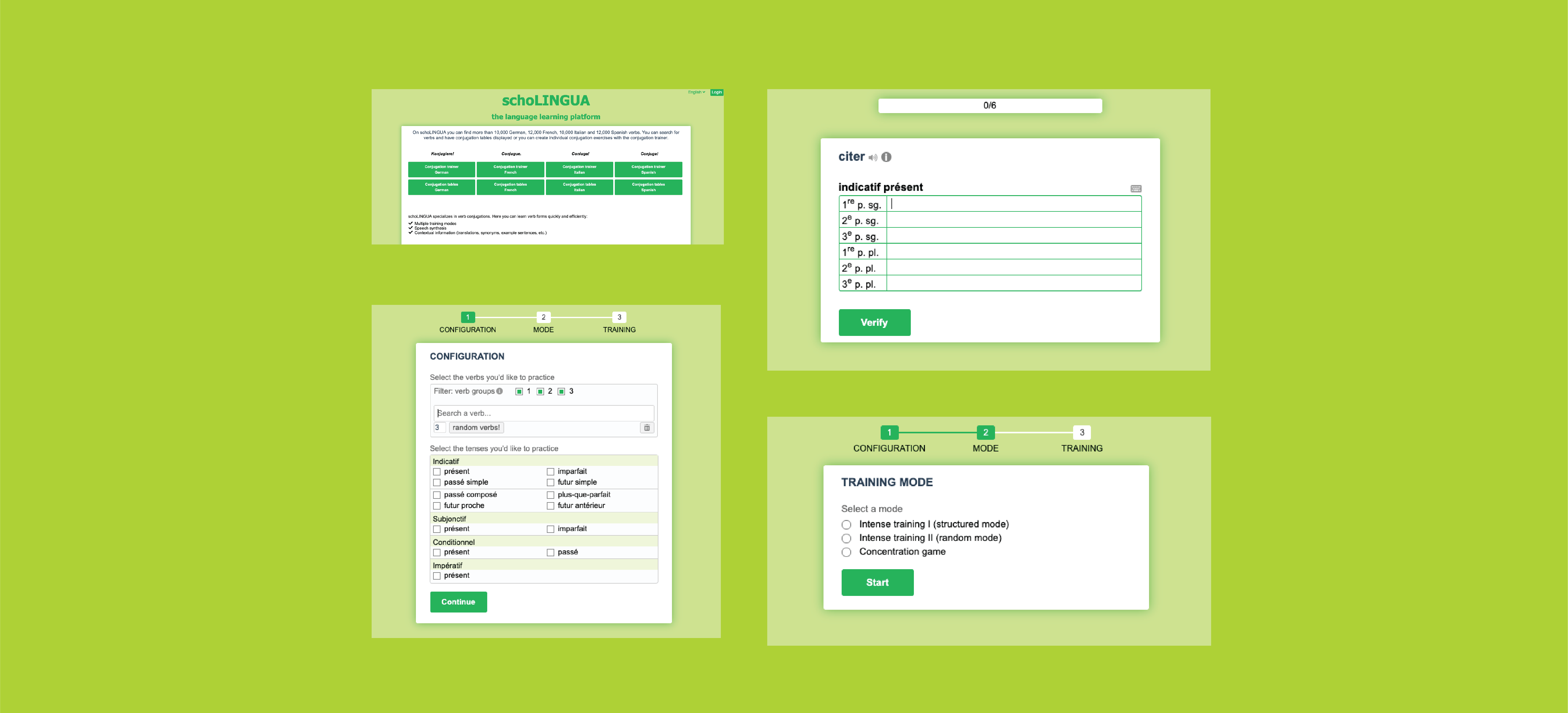
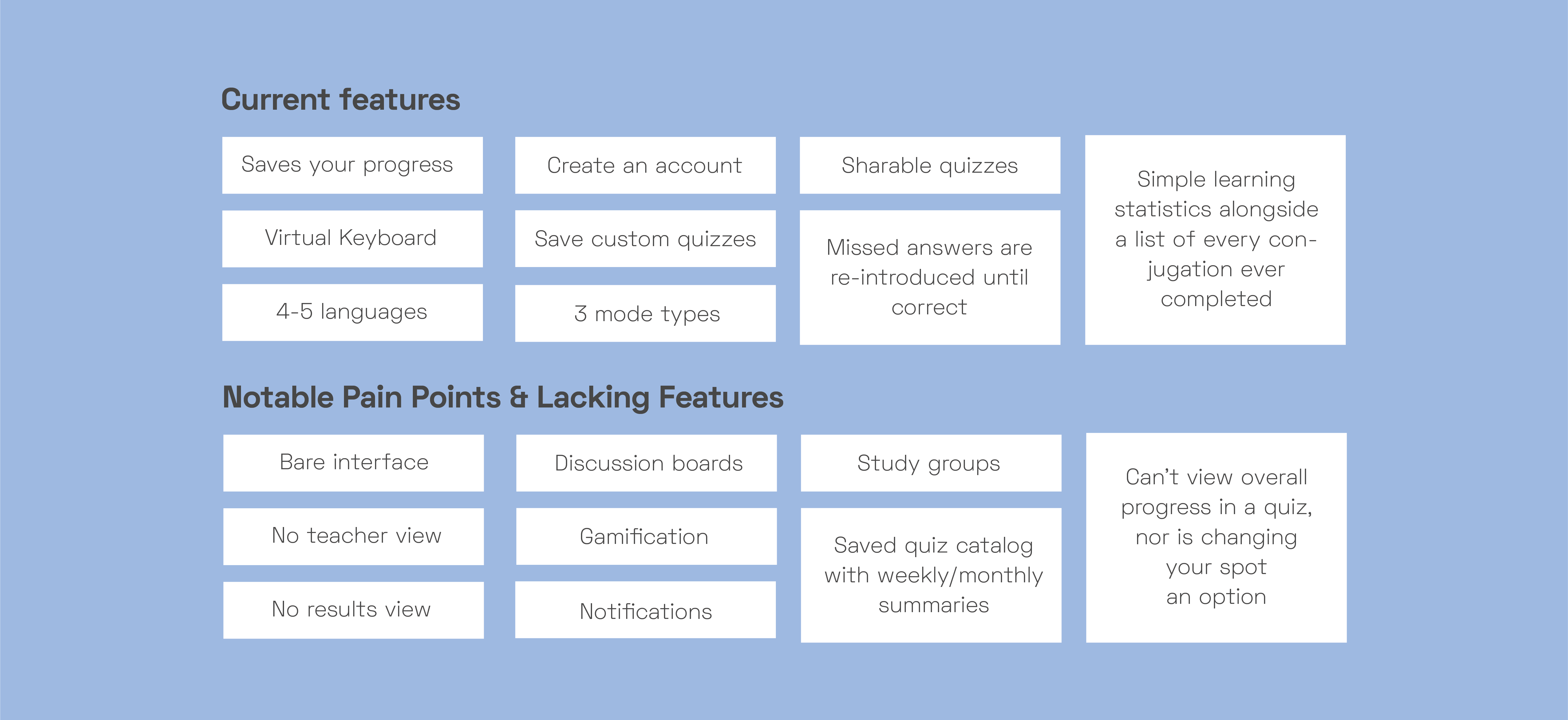
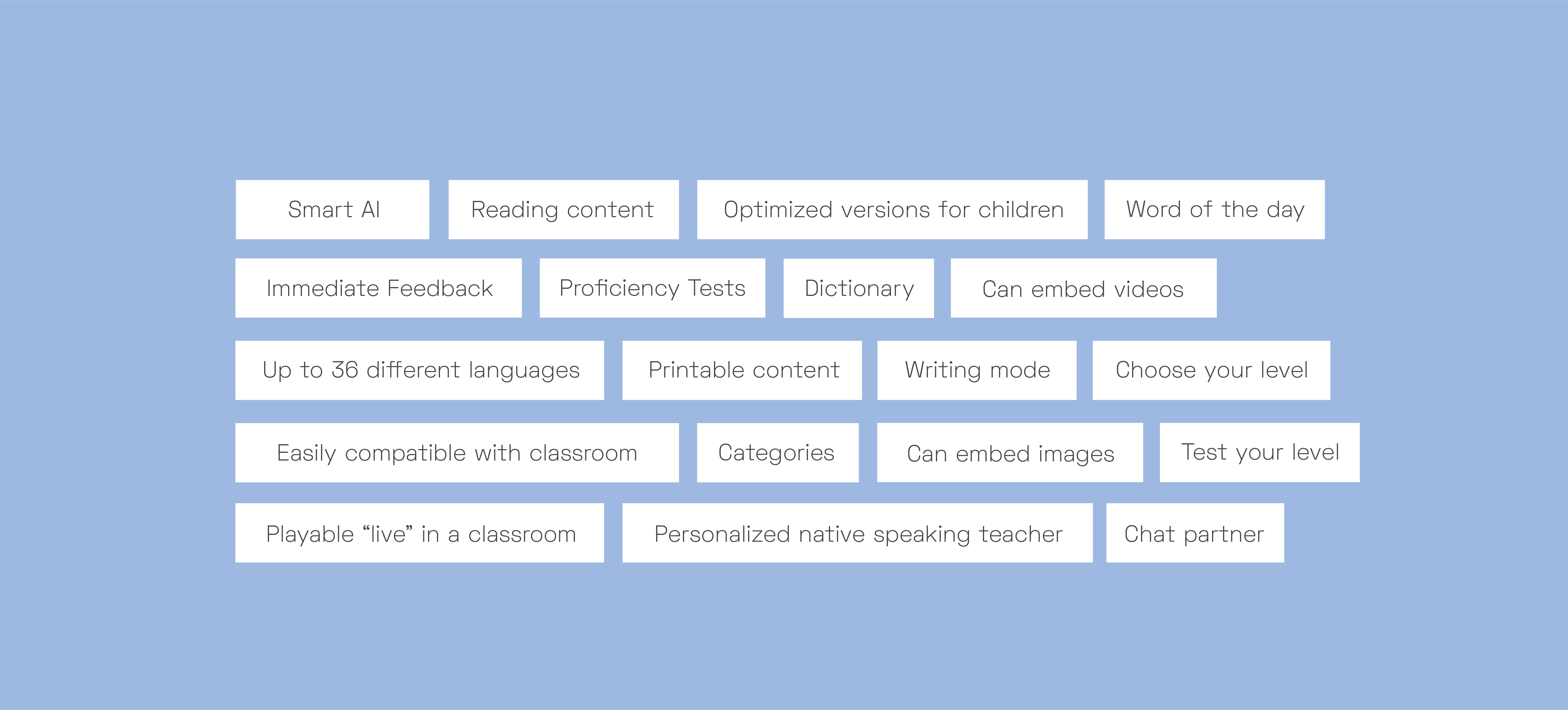
Upon looking at five other quiz-taking, language learning platforms, I compiled a list of their best features. Whether you're redesigning or creating an entirely new product, reinventing the wheel isn't always necessary. Identifying quality pre-existing user experiences is one of the first few steps in overhauling the UX of a product and making it much stronger, more useable, and personable.
.png)
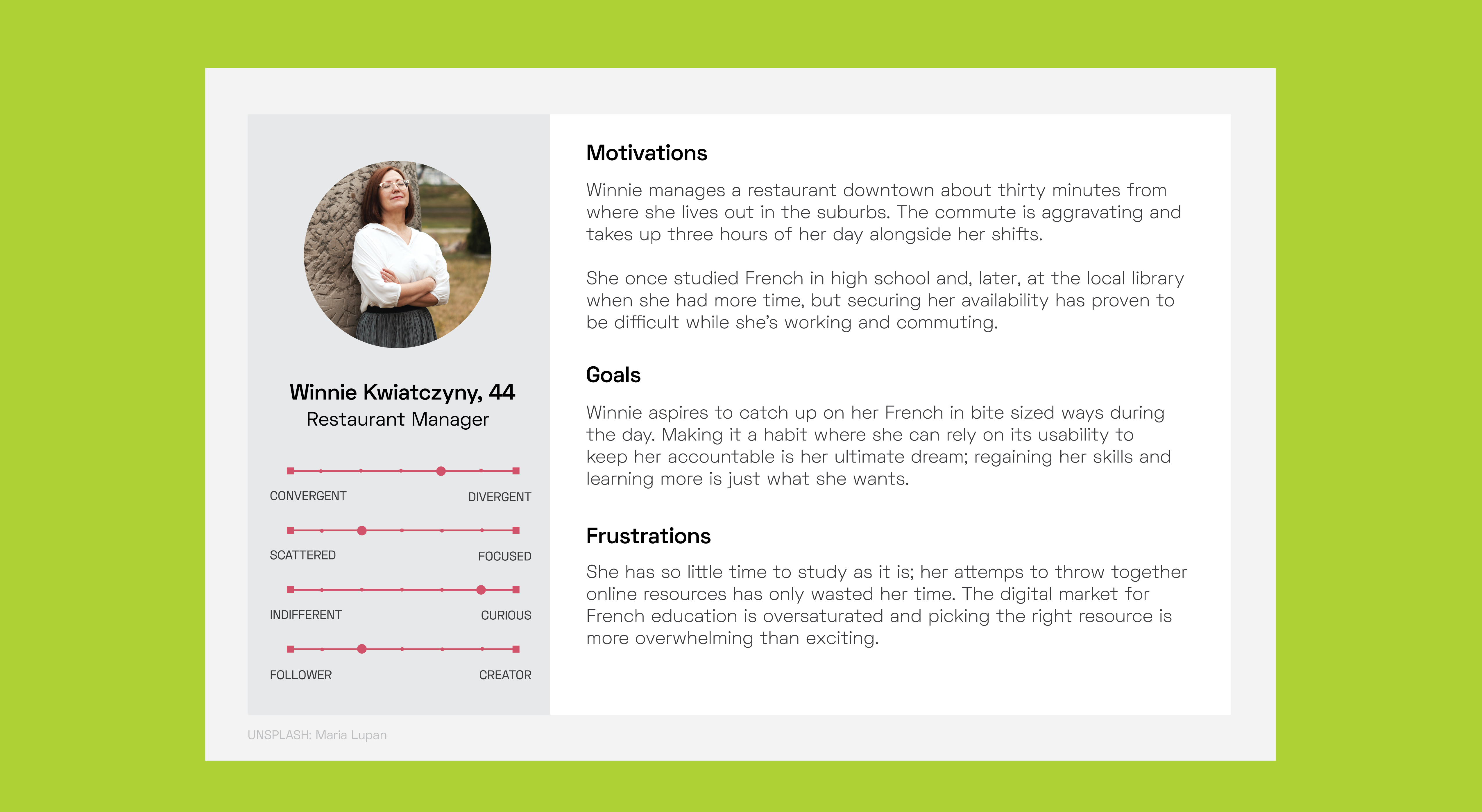
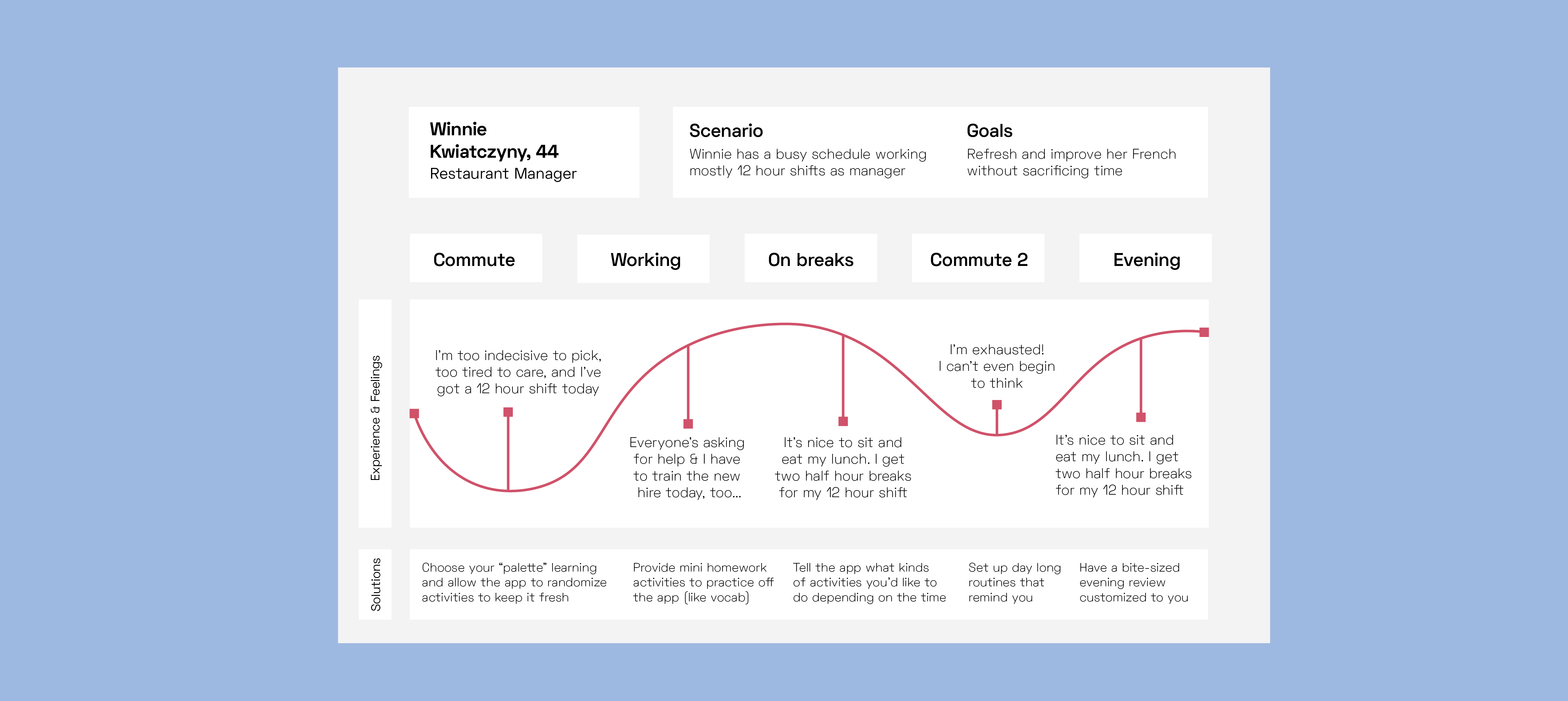
This map focuses on persona #3, Winnie Kwiatczyny, who is the perfect model. Imagining how the app can integrate itself into her day is an exciting challenge. Being a full-time manager with too little time standing in the way of routinely studying, I identified ways to incorporate schoLINGUA.
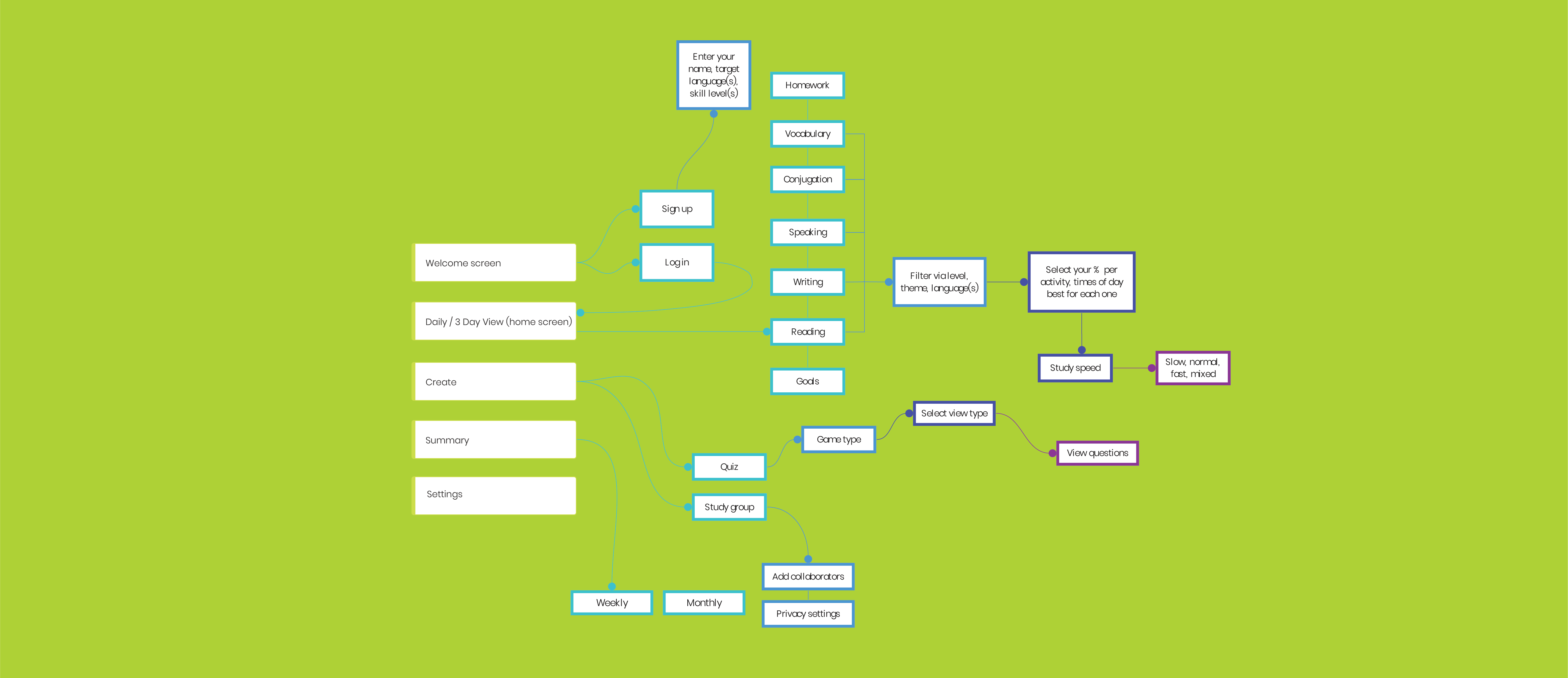
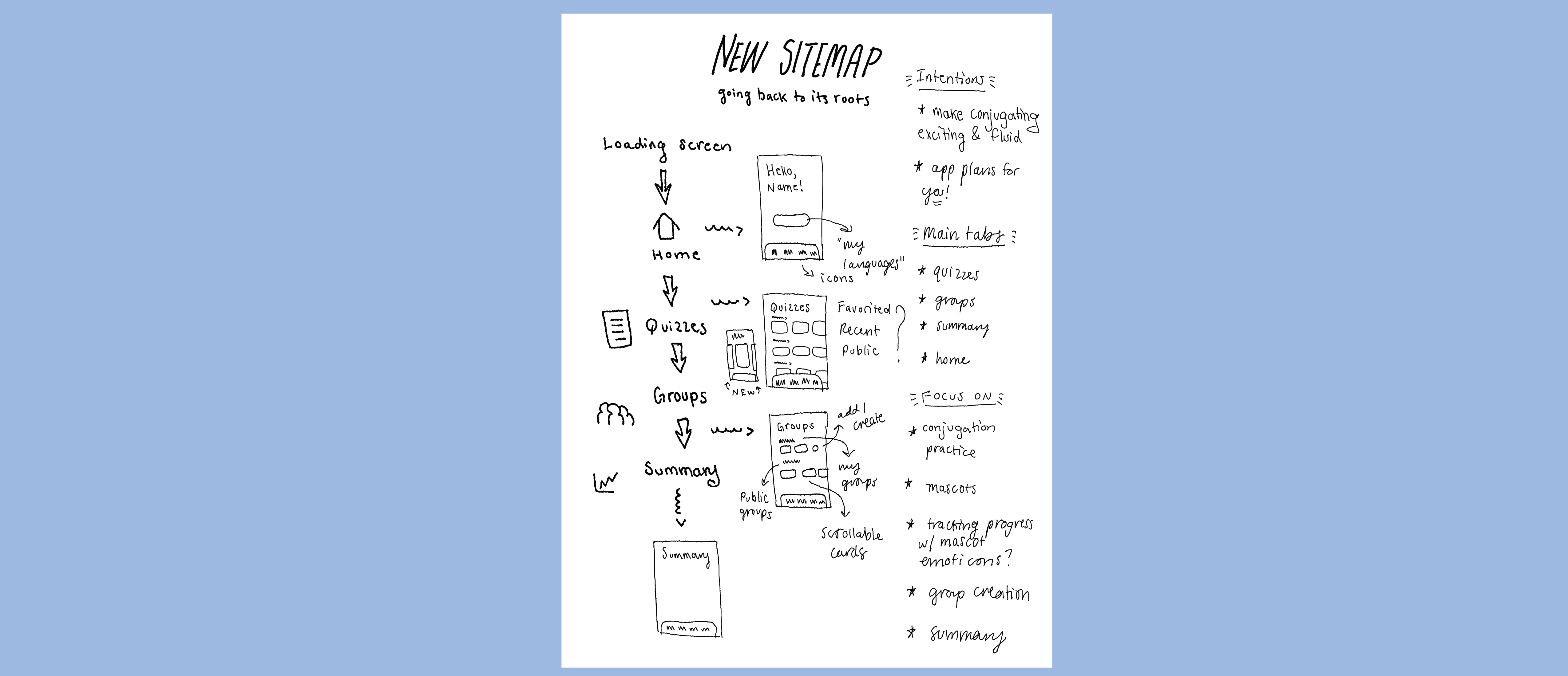
Creating a sitemap in Miro, I organized the main tabs, their following pages/features, and then their subsequent pages/features. While quite specific, the information architecture for the redesigns did not venture into too minute of details, like icons, buttons, or other clickable UI elements. In the wireframing process, I began messing with the visual layout of each page. Keeping it undetermined during the sitemapping process allowed for flexibility in redoing my prototypes until the ideal design had been settled.
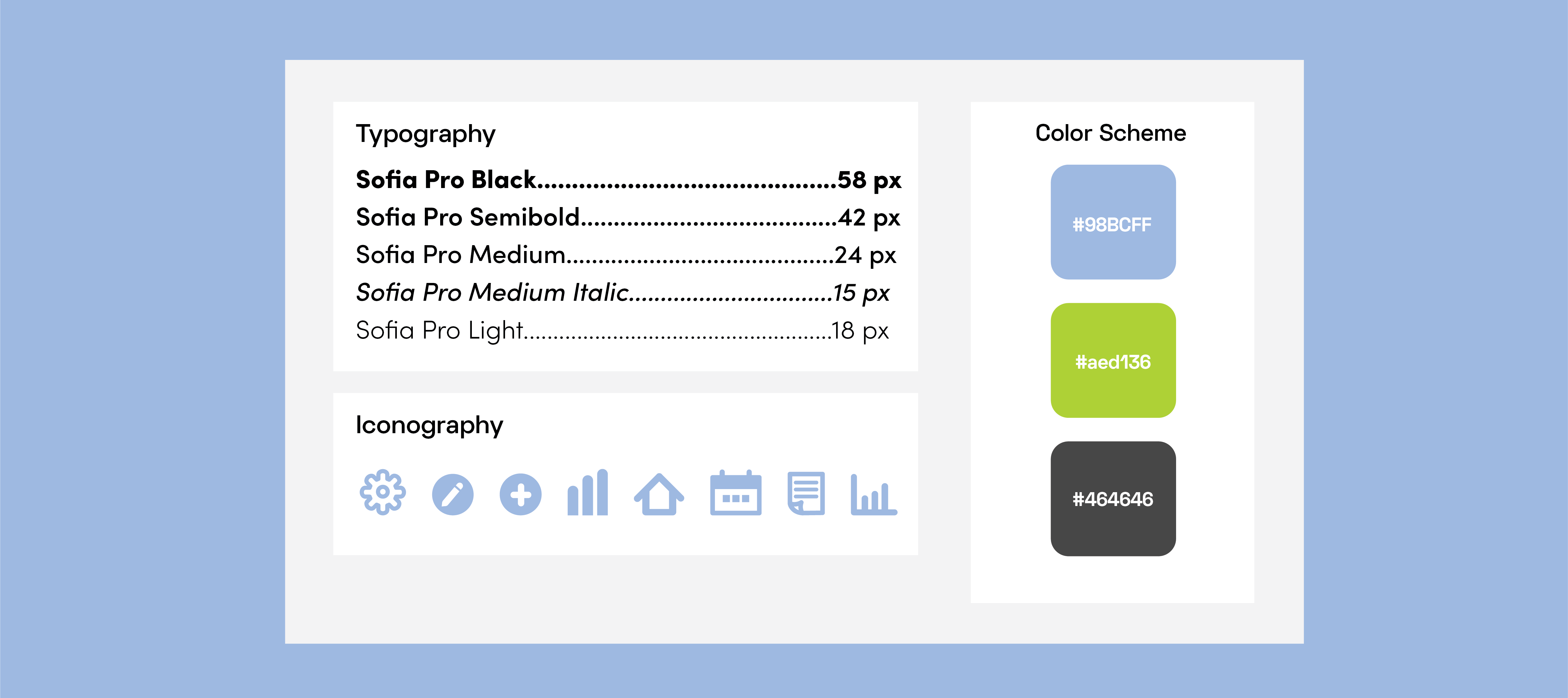
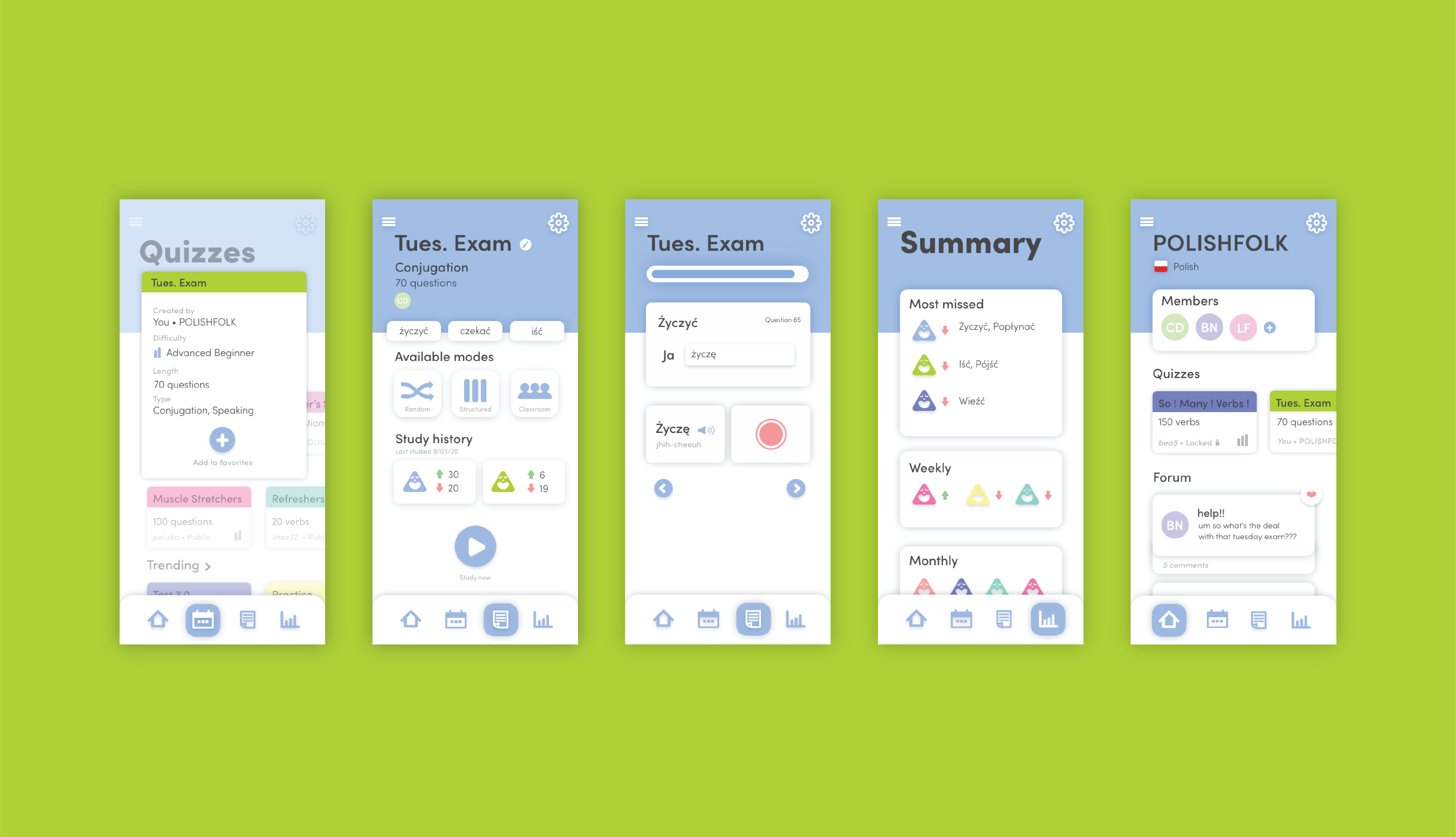
I wanted my color scheme and iconography to be simple, yet effective, with the user. My intention was to keep users feeling calm, even if a looming exam awaited or not much studying had been done recently. While the style guide is a constant work-in-progress as the designs are created, the current scheme provided a solid foundation for what was to follow.
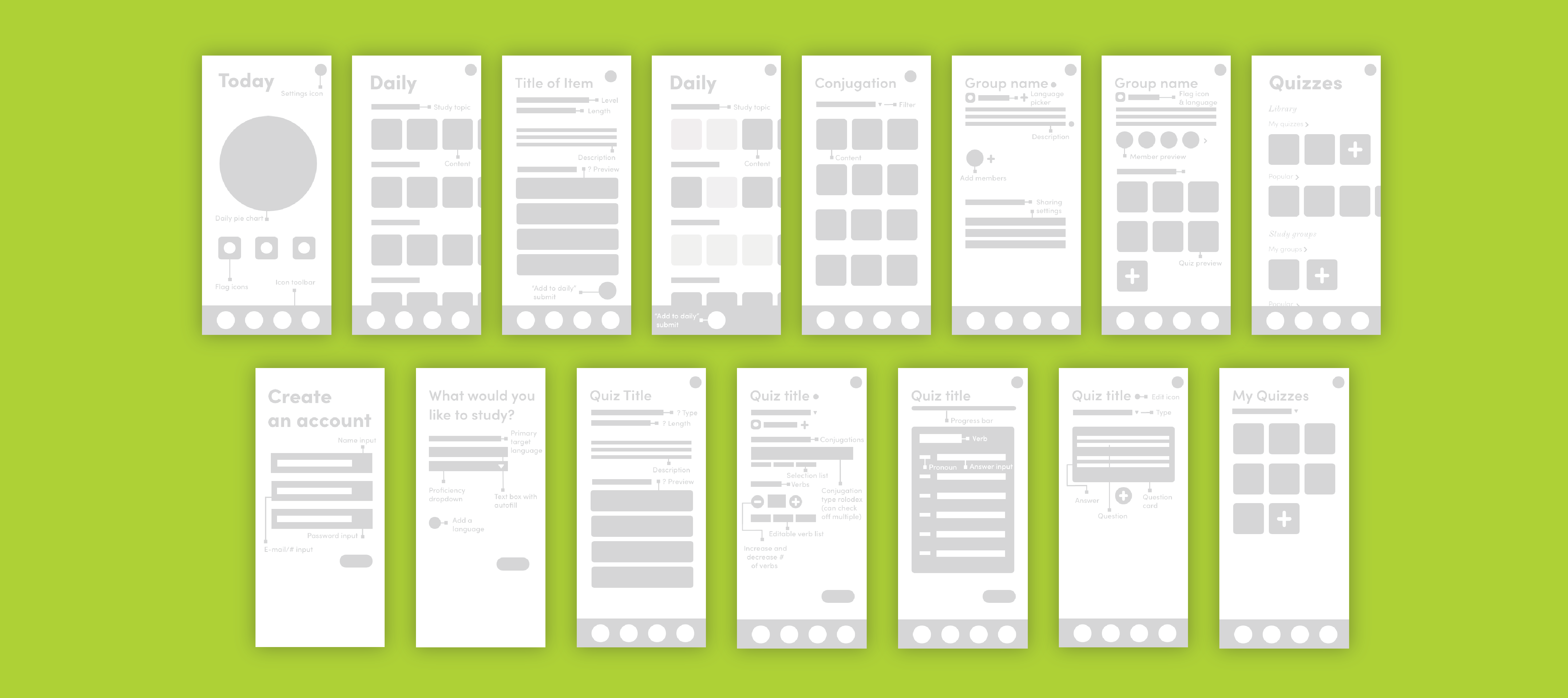
To further flesh out my visuals for the user's experience, I created low fidelity screens ranging from my "at a glance" tab to the other various tabs, including "daily" and "quizzes" alongside the subpages for creating and viewing a group. This provided a good sense of the set-up of the screens, which are further developed in the hi-fis.
After some time, I revisited my sitemap and devised a new one to better fit the user flow I was allotted the time to design.
With more time, I'd love to commit further research to specific linguistic methods that contribute to positive language learning routines, which I begun since the dawn of this project with The Art of Inventing Language and Becoming Fluent: How Cognitive Science Can Help Adults Learn a Foreign Language.
